Repository navigation
Releases: activeadmin-plugins/active_admin_theme
Release list
v3.1.1

A review of 3.1.0 found that one visual change lost information and that several of the checks shipped alongside it were quiet rather than wrong. Six fixes, each reproduced before and after.
Unsorted and descending looked the same
ActiveAdmin's sprite carries three glyphs — a double arrow for sortable-but-unsorted, up for ascending, down for descending. 3.1.0 drew the same down triangle for unsorted and descending, separated only by 0.6 against 1.0 opacity on an 8×4 shape, so a freshly loaded index showed every heading pointing down.
Three shapes again, drawn as masks in currentColor like the theme switch icons, so they still follow the heading colour into dark mode.
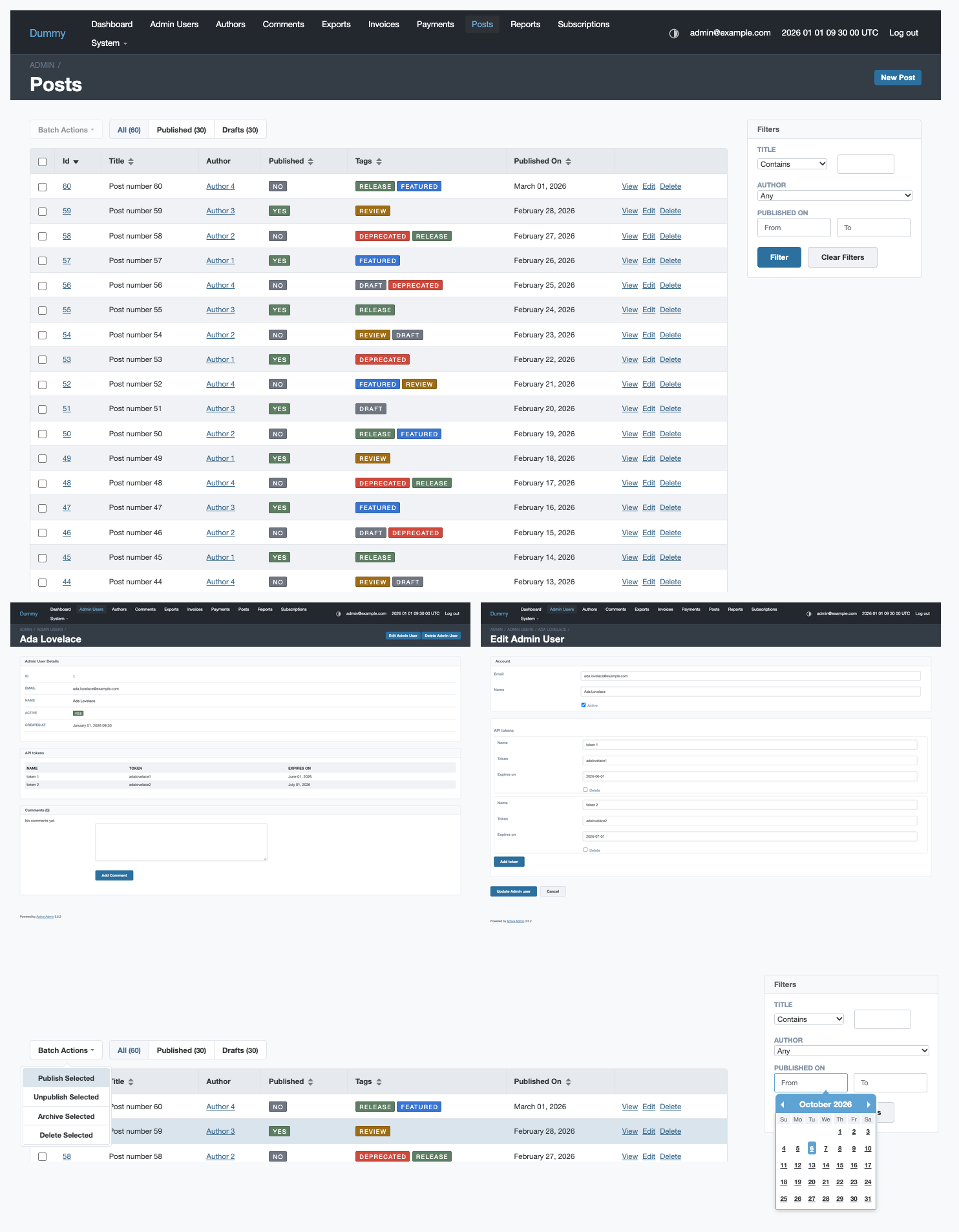
The type guards for the new palette were never tested
Deleting all five $skinStatusTag*Color entries from the colour guard map left rake css green. The single rejection fixture passed because none crashes mix() inside the theme, not because the guard fired — and a message naming gem internals is exactly what the guards exist to replace.
The rejection check now requires the message to name the variable the fixture set, and there is a fixture per variable rather than one standing in for five.
An example that failed the contract beside it
The "status tags recoloured" fixture paired a light label with four fills left at their defaults, giving 4.17 to 4.19:1 — under the 4.5:1 the contrast guard two screens away enforces. That guard only ever compiles the defaults, so it could not see its own neighbour.
Checks that hid each other
The contrast and README checks sat behind if failures.empty?, and the first aborted before the second ran, so a run could report one problem while holding three. They are collected and reported together now. For the same reason a single translucent fill no longer returns early and hides the other four.
Two lists that drift
TAG_COLOURS was five names typed out by hand — the drift DECLARED_ROWS was deleted for. It is read from the stylesheet now. And the !default scanner had no comment awareness, so a note like // was: $skinStatusTagOkColor: #8daa92!default; failed the build twice over, blaming the live declaration.
Smaller
- ActiveAdmin's sprite is cleared from every anchor in a sortable heading, not only the one the theme marks. An application's own link in a header kept the PNG and the 13px indent it needs.
$skinTableHeaderTextColorDarkderives from$skinTextColorDark, matching its light twin. It was a literal that happens to equal it today.- Source comments are English throughout.
Left for a minor
Two findings change how the theme looks and do not belong in a patch: the five tag fills are iso-luminant, and they sit at 2.87:1 against the striped dark-mode row background because they were tuned against the label alone. Both want new …Dark variants or a retune, which is additive. Neither affects the label contrast this line of releases is built on.
What's Changed
- 3.1.1: a sort marker you can read, and guards that actually guard by @Fivell in #59
- fix comments by @Fivell in #60
Full Changelog: v3.1.0...v3.1.1
Contributors

Assets 2
v3.1.0
Corrections to 3.0.0: readable status tags, headings that line up with their columns, and a theme switch that does not break the header.
Status tags
The label was black on mid-tone fills. White is the obvious answer and the wrong one on its own — against those fills it lands between 2.35:1 and 3.78:1, under the 4.5:1 WCAG AA asks of text this size. So the fills moved down with the label.
| fill | was | is | |
|---|---|---|---|
| neutral | #8a909a → #707681 |
3.21:1 | 4.57:1 |
| ok / published / green / yes | #8daa92 → #5e7e63 |
2.53:1 | 4.53:1 |
| notice / blue | #6090db → #3874d2 |
3.23:1 | 4.57:1 |
| warn / orange | #e29b20 → #9e6c15 |
2.35:1 | 4.56:1 |
| error / red | #d45f53 → #ce483b |
3.78:1 | 4.55:1 |
All six are variables now — the five fills plus $skinStatusTagTextColor — so a project with its own palette is not editing the stylesheet. $skinStatusTagTextColor: #000000; restores the old label.
Column headings
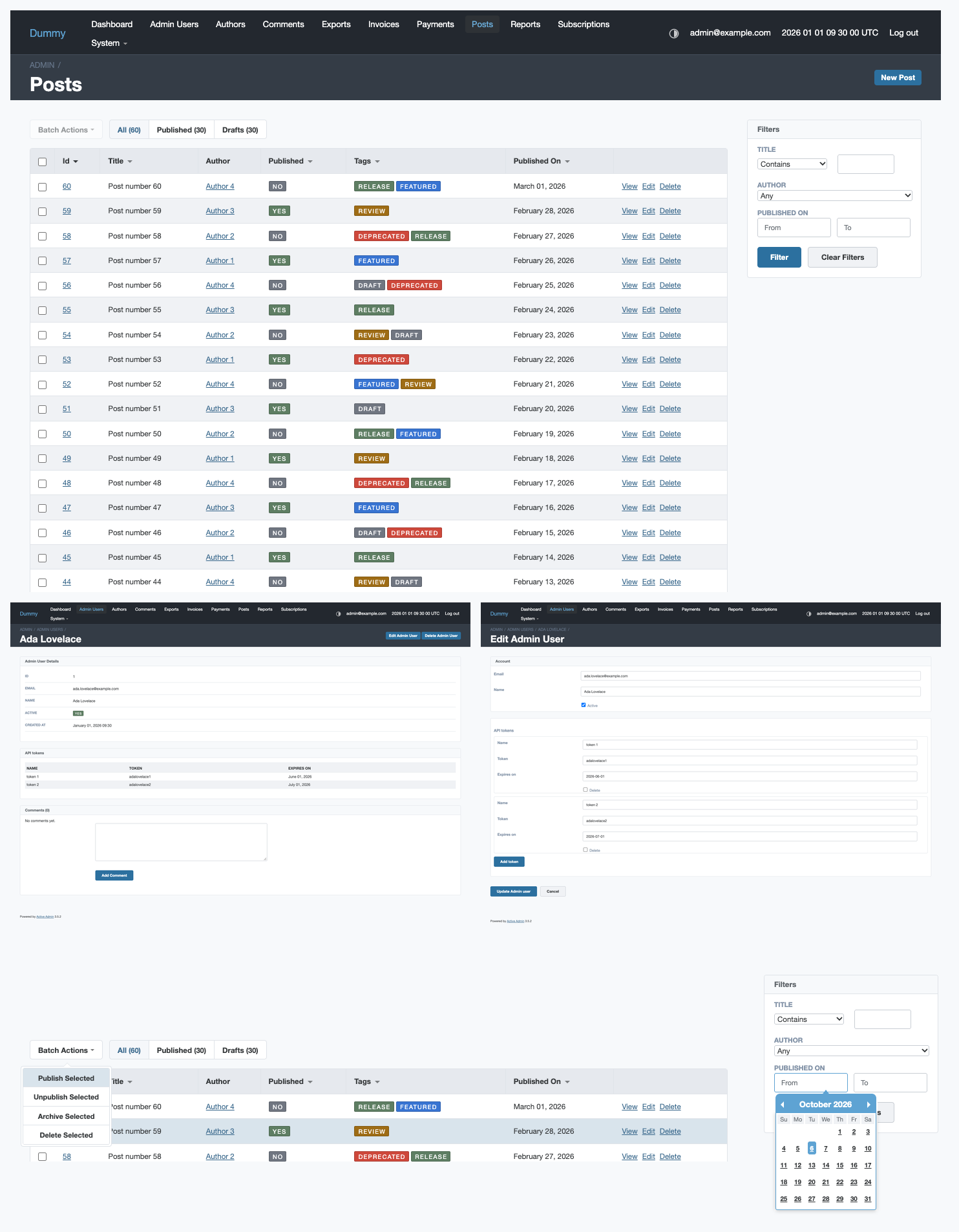
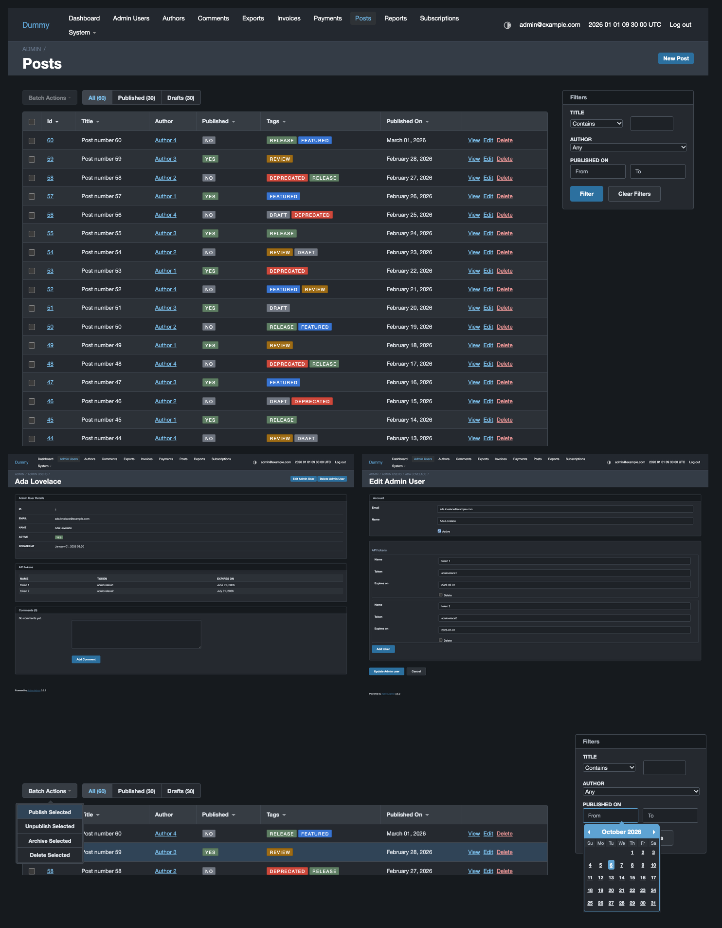
Sharper. $skinTableHeaderTextColor was a muted grey at 4.93:1 against the header fill while the rows underneath ran at 10.15:1. It takes $skinTextColor now, so a heading reads as strongly as its column.
Aligned. ActiveAdmin puts the sort arrow inside the heading link, on the left, cleared with padding-left: 13px — which indents the label of every sortable column by 13px while the data below starts at the cell's own padding. The marker is drawn by the theme now, after the label, in currentColor rather than ActiveAdmin's fixed grey sprite, so it also follows the text into dark mode.
The theme switch no longer breaks the header
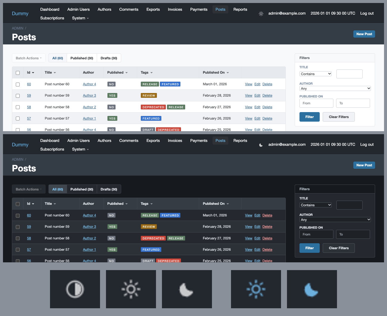
display: flex on the utility-nav list item fought ActiveAdmin's own li { display: inline }, pushing the username, clock and logout link onto a second row for anyone with more than the switch in that bar. Thanks to @dmitry-sinina for finding it.
Guards
rake css grew three checks, each written after something slipped past the absence of one:
- the README variables table is compared against the declarations in both directions — a variable with no row fails, a row naming nothing fails, and so does either listed twice;
- the status tag label contrast is computed from the shipped palette and fails under 4.5:1, with the colours resolved by Sass rather than parsed out of the output;
- a block-level item in the utility navigation fails the build, since that is what broke the header.
Upgrading
Everything that moved is reachable through a variable; see Upgrading.
What's Changed
- Fix theme toggle inline by @dmitry-sinina in #57
- White labels on status tags, sharper and aligned column headings by @Fivell in #56
- Release 3.1.0 by @Fivell in #58
Full Changelog: v3.0.0...v3.1.0
Contributors

Assets 2
v3.0.0 - dark and light modes
Dark mode, a theme switch, and a palette rebuilt around it.
Breaking: the default look changes
Every project that does not set variables gets a different admin. Each line below restores the old look on its own.
| was | is | restore with | |
|---|---|---|---|
| Header | blue ($skinMainSecondColor) |
anthracite #23282f |
see A worked example |
| Content links | the accent | #38678b |
$skinLinkColor: $skinMainSecondColor; |
| Primary buttons | the accent | darken($skinMainSecondColor, 20%) |
$skinButtonColor: $skinMainSecondColor; |
| Dropdown panels | $skinMainFirstColor / $skinMainSecondColor |
the surface palette | $skinSurfaceColor, $skinSurfaceHoverColor |
The accent was a fill colour doing duty as text: white on #5ea3d3 is 2.74:1 and the accent on white is 2.74:1, both under the 4.5:1 small text needs. Links and buttons now clear it; the header does not need to, since nothing reads at small size against it.
See Upgrading for the full list.
Dark mode
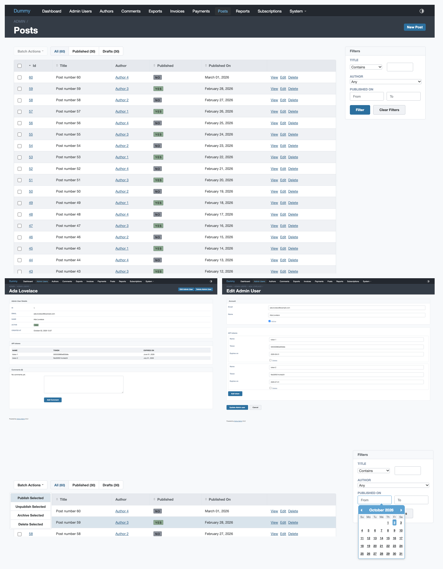
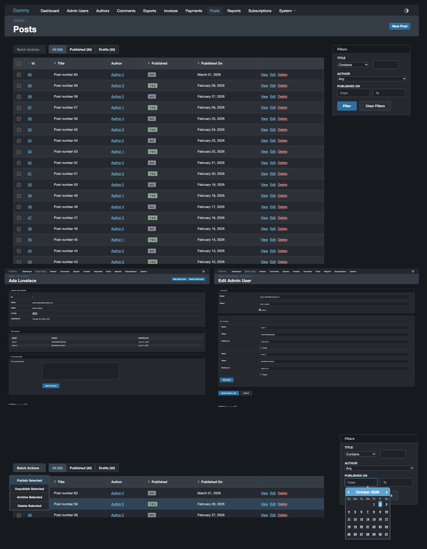
Follows prefers-color-scheme, and can be pinned per page with data-theme="light" or data-theme="dark" on <html>. Every colour has a …Dark twin, each defaulting to its light counterpart, so a project that only sets the light value keeps one consistent colour in both modes.
An optional theme switch
ActiveAdmin 3 has none. One icon for the state you are in, a click for the next: auto → light → dark. auto removes the attribute, so the page follows the system live; the other two pin the choice in localStorage. The third state exists so that following the system stays reachable — a two-state toggle writes a preference on the first click and has no way back.
// app/assets/javascripts/active_admin.js
//= require wigu/theme_toggle
The glyphs are inline SVG used as a CSS mask, so the gem ships no image files and there is nothing for a host CSP to allow. See Switching themes.
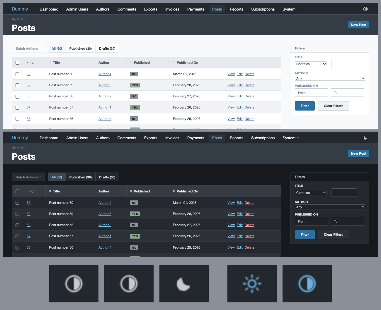
Form and filter controls
Also in this release
- Variables are typed. A wrong-typed override —
nonewhere a colour belongs, a length without its unit — fails the build naming the variable, instead of silently emitting CSS the browser discards. - The theme compiles in CI against a matrix of override configurations, and the README's variables table is checked against the declarations on every run.
- Header menu colours are configurable: dropdown panel, pill, item text and hover each have their own variable.
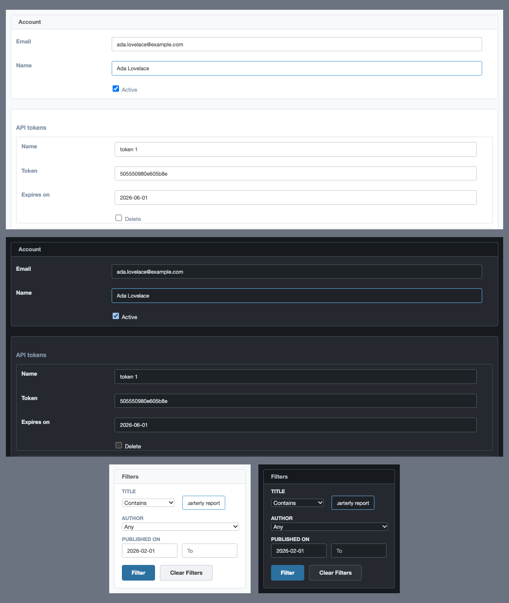
- Focus indicators on form controls, which a specificity bug had been suppressing entirely.
What's Changed
- Publish only a whitelist of files in the gem by @Fivell in #48
- Compile the theme in CI and reject wrong-typed variables by @Fivell in #50
- Header menu colors, with the review fixes applied by @Fivell in #51
- Flatten every form button, not only the submit input by @Fivell in #53
- Dark mode by @dmitry-sinina in #49
- Release 3.0.0 by @Fivell in #54
Full Changelog: v2.0.0...v3.0.0
Contributors
Assets 2
Screenshots
Images referenced from pull request comments. Not part of the repository.
v2.0.0
What's Changed
- rake >= 12.3.3 by @gigorok in #41
- Add NPM Module support by @Skumring in #42
- Modernize gemspec: require Ruby 3.1+, add activeadmin dependency by @Fivell in #44
- Add active_admin_sidebar toggle button styling by @Fivell in #43
- Bump version to 2.0.0 by @Fivell in #45
New Contributors
Full Changelog: v1.1.4...v2.0.0


