Repository navigation
fix: don't expose handler-less TouchableRipple as a disabled control - #5071
lukemorawski wants to merge 11 commits into
Conversation


|
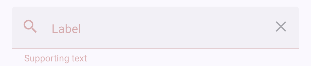
Review by Claude The same issue shows on all three platforms. Steps: open the example app, go to TextInput, then turn on "Error", "Disabled", "Leading icon" and "Trailing icon". What happens: the leading magnifier has no What should happen: both icons in a disabled field use the same color, as they did before this PR. (via Claude, verify if it makes sense) iOS
The magnifier is red and the clear icon is grey. (via Claude, verify if it makes sense) Android
The magnifier is red and the clear icon is grey. (via Claude, verify if it makes sense) Web
The magnifier is |



 satya164
left a comment
satya164
left a comment
There was a problem hiding this comment.
Review by Claude
- The branch conflicts with
maininTouchableRipple.tsx,TouchableRipple.native.tsx,TextInputIcon.tsxand most snapshots. Two new tests depend on thingsmainhas since removed. #5099 droppedtestID="touchable-ripple-underlay", so after the rebase the two "does not show press feedback" tests pass without checking anything, becausequeryByTestIdnever finds that ID. #5078 replaced IconButton'sSurface, so thedecorative-container-outer-layerandclear-container-outer-layerIDs in "dims a disabled TextInput.Icon exactly once" no longer exist. - The PR description still says
IconButton.getIconColorwas reordered so an explicit color wins. That change was reverted, and the new IconButton test asserts the opposite. Please update the description so the squash commit does not describe a change that is not in it. DataTable.Titlehas the same bug outsideTouchableRipple:DataTableTitle.tsxsetsdisabled={!onPress}on itsPressable. On web a title withoutonSortPressrenders as<button disabled>("Calories per piece" and "Fat (g)" in the DataTable example). (via Claude, verify if it makes sense)
| <Animated.View | ||
| {...rest} | ||
| ref={ref} | ||
| // Pressable defaults this to true, so keep it to preserve any role and | ||
| // state the caller set, e.g. a read only checked CheckboxItem. | ||
| accessible={rest.accessible !== false} | ||
| // Drop the claim, keep the element so its label is still announced. | ||
| role={claimsActivatable ? 'none' : rest.role} | ||
| // A consumer role of button makes react-native-web render a real | ||
| // <button>, which is tabbable by default. Nothing to activate here. | ||
| focusable={rest.focusable ?? false} | ||
| style={containerStyle} | ||
| > | ||
| {React.Children.only(children)} | ||
| </Animated.View> |
There was a problem hiding this comment.
This branch adds two things the project avoids in new code:
- React Native's
Animated.View. Nothing animates here, andmainmoved to Reanimated in refactor: migrate components to Reanimated #5015. A plainViewtype-checks here, so theAnimatedimport can go too. React.Children.only. The plain view can renderchildrendirectly. The Children API breaks with fragments and wrappers and hides the data flow.
| <Animated.View | |
| {...rest} | |
| ref={ref} | |
| // Pressable defaults this to true, so keep it to preserve any role and | |
| // state the caller set, e.g. a read only checked CheckboxItem. | |
| accessible={rest.accessible !== false} | |
| // Drop the claim, keep the element so its label is still announced. | |
| role={claimsActivatable ? 'none' : rest.role} | |
| // A consumer role of button makes react-native-web render a real | |
| // <button>, which is tabbable by default. Nothing to activate here. | |
| focusable={rest.focusable ?? false} | |
| style={containerStyle} | |
| > | |
| {React.Children.only(children)} | |
| </Animated.View> | |
| <View | |
| {...rest} | |
| ref={ref} | |
| // Pressable defaults this to true, so keep it to preserve any role and | |
| // state the caller set, e.g. a read only checked CheckboxItem. | |
| accessible={rest.accessible !== false} | |
| // Drop the claim, keep the element so its label is still announced. | |
| role={claimsActivatable ? 'none' : rest.role} | |
| // A consumer role of button makes react-native-web render a real | |
| // <button>, which is tabbable by default. Nothing to activate here. | |
| focusable={rest.focusable ?? false} | |
| style={containerStyle} | |
| > | |
| {children} | |
| </View> |
(via Claude, verify if it makes sense)
There was a problem hiding this comment.
done, it's a plain View now and renders children as they are. if children or style is a function it gets called with { pressed: false, hovered: false, focused: false }.
I also took React.Children.only out of the Pressable path. otherwise a ripple with 2 children and no onPress renders fine, and then crashes when onPress gets added. it was only there from back when this wrapped TouchableNativeFeedback / TouchableHighlight, nothing needs a single child anymore.
| <Animated.View | ||
| {...rest} | ||
| ref={ref} | ||
| // Pressable defaults this to true, so keep it to preserve any role and | ||
| // state the caller set, e.g. a read only checked CheckboxItem. | ||
| accessible={rest.accessible !== false} | ||
| // Drop the claim, keep the element so its label is still announced. | ||
| role={claimsActivatable ? 'none' : rest.role} | ||
| // A consumer role of button makes react-native-web render a real | ||
| // <button>, which is tabbable by default. Nothing to activate here. | ||
| focusable={rest.focusable ?? false} | ||
| style={[ | ||
| styles.touchable, | ||
| borderless && styles.borderless, | ||
| styles.disabled, | ||
| typeof style === 'function' ? style(state) : style, | ||
| ]} | ||
| > | ||
| {React.Children.only( | ||
| typeof children === 'function' ? children(state) : children | ||
| )} | ||
| </Animated.View> |
There was a problem hiding this comment.
Same as in the native file. Use a plain View instead of React Native's Animated.View (nothing animates and main uses Reanimated), and render the children without React.Children.only.
| <Animated.View | |
| {...rest} | |
| ref={ref} | |
| // Pressable defaults this to true, so keep it to preserve any role and | |
| // state the caller set, e.g. a read only checked CheckboxItem. | |
| accessible={rest.accessible !== false} | |
| // Drop the claim, keep the element so its label is still announced. | |
| role={claimsActivatable ? 'none' : rest.role} | |
| // A consumer role of button makes react-native-web render a real | |
| // <button>, which is tabbable by default. Nothing to activate here. | |
| focusable={rest.focusable ?? false} | |
| style={[ | |
| styles.touchable, | |
| borderless && styles.borderless, | |
| styles.disabled, | |
| typeof style === 'function' ? style(state) : style, | |
| ]} | |
| > | |
| {React.Children.only( | |
| typeof children === 'function' ? children(state) : children | |
| )} | |
| </Animated.View> | |
| <View | |
| {...rest} | |
| ref={ref} | |
| // Pressable defaults this to true, so keep it to preserve any role and | |
| // state the caller set, e.g. a read only checked CheckboxItem. | |
| accessible={rest.accessible !== false} | |
| // Drop the claim, keep the element so its label is still announced. | |
| role={claimsActivatable ? 'none' : rest.role} | |
| // A consumer role of button makes react-native-web render a real | |
| // <button>, which is tabbable by default. Nothing to activate here. | |
| focusable={rest.focusable ?? false} | |
| style={[ | |
| styles.touchable, | |
| borderless && styles.borderless, | |
| styles.disabled, | |
| typeof style === 'function' ? style(state) : style, | |
| ]} | |
| > | |
| {typeof children === 'function' ? children(state) : children} | |
| </View> |
(via Claude, verify if it makes sense)
There was a problem hiding this comment.
same here, done
| // one. A decorative icon keeps it, nothing else dims it. | ||
| isInteractive && disabled ? styles.notDimmed : null, | ||
| ]} | ||
| disabled={isInteractive ? disabled : undefined} |
There was a problem hiding this comment.
When a field is disabled and has an error, the two icons now get different colors. The decorative icon keeps getIconColor's result (the error color). The interactive icon gets disabled, and IconButton replaces its color with onSurface. Before this PR both icons used the same color. The same split happens with an explicit iconColor.

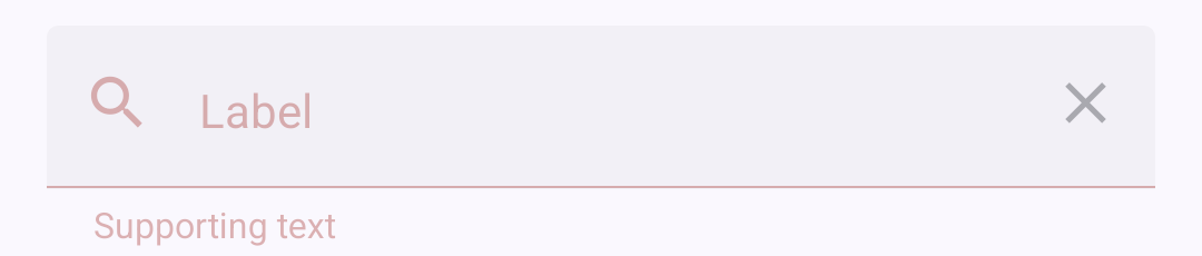

On web the magnifier is rgb(179, 38, 30) and the clear icon is rgb(29, 27, 32), both at 0.38 opacity.
Pick one rule for both icons. For example, give the decorative icon the same disabled color in getIconColor when isDisabled is true, or keep the interactive icon on color and stop IconButton from overriding it. (via Claude, verify if it makes sense)
There was a problem hiding this comment.
yep, you're right, and it's caused by this PR. on main TextInput.Icon never passed disabled to IconButton, so both icons were red. now the clear button really is a disabled button, and IconButton colours it onSurface.
I don't want to fix it by not passing disabled again, because then the clear button on a disabled field isn't a button at all, which is the opposite of what this PR is for.
so the real question is what wins in a field that is disabled and has an error:
- TextInput on main: error, for everything (label, outline, supporting text, icons)
- Checkbox (fix(checkbox)!: align state layer, touch target and focus ring with Material 3 #5104): disabled
- Compose M3, Material Web, Flutter M3: disabled. material web doesn't even set the error class on a disabled field (
'error': this.error && !this.disabled) - fix(text-input): correct MD3 states and accessibility #5111 switches the whole TextInput to disabled first
once #5111 is in, both icons are onSurface with the default colours. with a custom iconColor they still split though, because getIconColor checks iconColor first and IconButton checks disabled first. Checkbox avoids that by putting disabled before the custom colour too, so getIconColor would need the same to fully fix it.
your second option (keep the clear icon on color and stop IconButton overriding it) means changing IconButton's colour order for every disabled IconButton with iconColor, which is what got pushed back on earlier in this PR, so I'd rather not.
@Doberjohn should #5111 go first, or should I change just getIconColor here (disabled before the custom colour and before error)? it's the same function #5111 touches so the conflict would be easy. what do you prefer?
one more thing for whichever of the two lands second: #5111 disables TextInput.Icon with onPress={disabled ? undefined : onPress} + aria-disabled. that only works because of the bug this PR fixes. with this PR an icon without a handler isn't a button anymore, so the clear button on a disabled field would end up as role="none" with aria-disabled. it has to pass disabled like this PR does.
#5111 also hides decorative icons completely (aria-hidden, pointerEvents="none"), while this PR keeps them with their label. I'm fine either way for TextInput.Icon, we just need to pick one.
| <View | ||
| testID={`${testID}-icon-opacity`} | ||
| style={{ opacity: iconOpacity }} | ||
| > |
There was a problem hiding this comment.
This adds a derived testID to a public component only so a test can read an internal opacity. main removed derived testIDs in #5099 and the default testID in #5088, so after the rebase this renders undefined-icon-opacity when no testID is passed. The "dims a disabled TextInput.Icon exactly once" test also asserts internal styles instead of public output. Please drop the testID and cover the dim-once case with a snapshot of the disabled field, which the suite already does for other states.
| <View | |
| testID={`${testID}-icon-opacity`} | |
| style={{ opacity: iconOpacity }} | |
| > | |
| <View style={{ opacity: iconOpacity }}> |
(via Claude, verify if it makes sense)
There was a problem hiding this comment.
removed it. the "dims once" case is now a snapshot of a disabled field with both icons in it.
| expect(plain).not.toBeDisabled(); | ||
| // no Pressable underneath, so nothing claims the touch. A responder here | ||
| // would swallow taps meant for whatever wraps this, e.g. TextInput's | ||
| // press to focus. | ||
| expect(plain).not.toHaveProp('onStartShouldSetResponder'); |
There was a problem hiding this comment.
These assertions check internal props (onStartShouldSetResponder, focusable). The regression the PR description names, a handler-less ripple swallowing the tap meant for its parent, can be tested through public behavior. This passes on this branch and fails when the ripple claims the touch (for example with only onPressIn set):
it('lets a press reach the parent when no touch handler is passed', async () => {
  const onPress = jest.fn<(e: GestureResponderEvent) => void>();

  await render(
    <Pressable onPress={onPress}>
      <TouchableRipple>
        <Text>Icon</Text>
      </TouchableRipple>
    </Pressable>
  );

  await userEvent.press(screen.getByText('Icon'));

  expect(onPress).toHaveBeenCalledTimes(1);
});
(via Claude, verify if it makes sense)
There was a problem hiding this comment.
added yours, thanks. it fails if the ripple grabs the touch.
the rest of this file and TouchableRippleWeb.test.tsx now check role, name and toBeDisabled instead of internal props. the two "does not show press feedback" tests didn't check anything anymore after #5099 removed the testID, so I replaced them.


1d11c75 to
ad9433c
Compare

|
Found potential problems with the pull request:
|

|


Motivation
TouchableRipplediddisabled = disabledProp || !hasPassedTouchHandler, so anything without a press handler was announced as a disabled control. Display-only stuff (a decorativeTextInput.Icon, a read onlyCheckboxinList.Item, aChiporButtonwith no handler) all showed up as disabled buttons.Split into two flags:
Non-controls render a plain
Viewinstead of aPressable:aria-disabledbutton,imagebutton,link,menuitem,tab) becomenone, the element and its label staycheckboxare kept, a read only checkbox is still a checked checkboxfocusabledefaults tofalse, otherwise on web it's a tab stop, RNW turnsrole="button"into a real<button>pressed: false)togglebuttoncounts as activatable toodisabledstill gives a disabled control, same as before.Why drop the
Pressableinstead of just passingdisabledthrough:disabledalso gates responder claiming (Pressability,onStartShouldSetResponder: () => !disabled). Fixing only the announcement turns claiming on, and handler-less ripples start swallowing taps meant for the parent.TextInputwraps its icons in aPressablethat focuses the input, so that's where it shows first.Trade-off: having a handler or not now renders a different element, so
onPress={busy ? undefined : fn}remounts the children (focus, state). Toggle withdisabledinstead, that keeps the same element. Documented ononPressand in the migration guide, and pinned by a test.Also in here:
DataTable.Titlehad the same bug outside TouchableRipple,disabled={!onPress}on its ownPressable. Same fix.RadioButton.Android/RadioButton.IOSdropped their handler when disabled instead of passingdisabled, so a disabled radio would have turned into a non-control. Now forwardsdisabledlikeCheckbox.React.Children.onlygone from TouchableRipple, it was left over from when it wrappedTouchableNativeFeedback/TouchableHighlight. Without it the plain View and the Pressable accept the same children.TextInput.Iconfaked disabled by nulling its own handler, which only worked because of this bug. Now forwardsdisabledwhen it has a handler, so the clear button on a disabled field is still a disabled button. IconButton dims it itself, so the field wrapper dim is cancelled for that icon, otherwise it's 0.38 * 0.38. A caller's ownopacityon such an icon in a disabled field is overridden by that.Known, open: on a disabled field with error the clear icon goes onSurface (IconButton's disabled colour) and the decorative one stays red (TextInput's
getIconColoris error first). See the review thread, it's tied to #5111.Related issue
Closes #5070
Supersedes #5011, which fixes the same symptom in
Chip.tsxonly by injecting an emptyonPress. That swaps a false "disabled" for a false "enabled" and leaves the other consumers broken.Test plan
Lint, typecheck (incl. legacy RN types) and tests pass.
Tests assert public output only: role, name,
toBeDisabled, and a press on a handler-less ripple reaching its parentPressable. The new tests were mutation checked (each fails with its fix reverted or broken). Tests on main that pinned the old behaviour are updated: handler-less Checkbox reported as disabled (#5104), handler-less Button reported as disabled, and the #5046 render prop tests that usedtestOnly_pressedwithout a handler.On device against main, example app. iOS sim (iPhone 16 Pro), Android emu (API 36), Chrome.
TextInput, "Leading icon" on. Magnifier has no handler, clear button does.
<button disabled>(web)Android keeps the magnifier
Viewin the a11y tree after theAnimated.View->Viewchange, it's not flattened away.DataTable, unsortable titles ("Calories per piece", "Fat (g)"): disabled on iOS and Android and
aria-disabledon web on main, not disabled with this PR. Sortable title still sorts. Handler-lessDataTable.Rowon iOS also stops beingenabled=false.List.Item with a read only
<Checkbox status="checked" />: disabled on main, checked and not disabled with this PR, all three.Tap on the magnifier, and DataTable titles (iOS, Android):
ios-T1-branch.mp4
and-T1-branch.mp4
ios-T4-branch.mp4
and-T4-branch.mp4
Disabled field with error (Android, iOS, web):